Some Common Business Website Mistakes
A Business website is your showcase, it is increasingly the way other businesses or customers find out about your business, it’s a way of making it easier for your prospects and customers to find you, find your products and contact you.
The internet is also the place your competitors live and it’s a jungle out there so making mistakes here can be costly not just in your bottom line but also in your reputation and perceived quality and professionalism.
Whilst the list below doesn’t list all mistakes, it does show some of the more common and easily fixed.

Your website isn’t responsive.
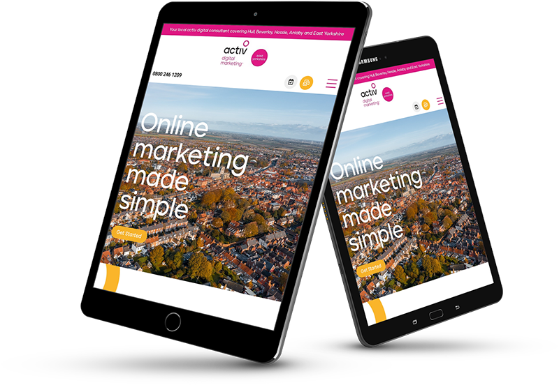
This can be down to a perceived saving in cost but is more likely that your site is an older one, increasingly your customers are likely to be looking for your products or services using a tablet or mobile phone and if your site isn’t responsive and unless what you provide is totally unique your visitors will quickly bounce off your site and look for another supplier. Another downside is that a non-responsive site will also affect your SEO results.
Easily fixed, there is no excuse these days for having a non-responsive website.
Missing Call-To-Action (CTA)
Unless your website tells the visitor everything they need to know (unlikely) a missing price, some missing information, your location, how they can get your products or services or a missing contact form means your visitors, no matter how much they want to buy from you, have to go elsewhere. Be clear and concise about what the visitor needs to do next to purchase or contact you.
All phone numbers and email addresses should be “Tap-To Call/Email” when the visitor is on a call enabled device.
Easily fixed.
A template or self-build free website.
Although many businesses start this way due to lack of funds the majority eventually find that this route doesn’t allow them to differentiate their brand, is restrictive in how they can customise their websites or shows pop-up adverts often showing competitors’ products. If you need to make your business stand out from the crown a template just isn’t going to cut it.
Domain name
A domain name defines your brand, it had to be easy to remember and not be too long, if the domain you dreamed of has gone, think of sensible alternatives if you can’t live without your first choice check with the owner to see if it is for sale, many high quality domains are simply “parked” by people wanting to sell them on (at a profit).
Website Navigation
There are few things worse than arriving on a website where you know it has what you are looking for but you can’t find it. Badly designed navigation can be as off putting as a badly designed website.
Always check your navigation on a selection of different devices, have someone (not you or the web designer) check the website and make sure it is intuitive, add breadcrumbs so that visitors know where they are and allow them to navigate back to a previous page if they feel they are going down the wrong path.
Easily fixed.
Dead pages
Remember when you designed your website and added a page for everything, not everyone wants to know about your flower pressing hobby or your holiday on Everest (unless they are related to your products or services), use your website analytics to find out which pages are most popular, which pages are generating business and which pages are never visited. Your website is your business marketing tool and you can do without wasting time and energy maintaining pages that no one is interested in.
Website Analytics
Check your website analytics regularly, that’s what they are there for, you need to know if visitors are landing on your website and clicking off it straight away, determine what is working and what could be improved.
Easily fixed.
Spelling mistakes and grammar
Get someone to proof read your website pages, some spelling mistakes are easy to spot (the editor highlights them) others are simply the wrong word for the text “their, there, fur, fair, fare etc.” so not so easy at a glance.
Easily fixed.
Colours and Fonts
Some colours go together some don’t, some fonts are easy to read some are not, think about colours and fonts when you are designing the website I know of at least one business website (not one of ours !) that is yellow background, red text using comic sans font and its awful, again if you are unsure get advice.
Easily fixed.
Contact Information
Make sure every page allows the user to contact you or to find your contact details, make sure the contact details are always kept up to date along with the hours you are available, it isn’t the customers fault if they call you at 2pm on a Sunday if you haven’t informed them that you work 9-5 Monday to Friday.
Easily fixed.
Not informing customers that you have a website
Social media posts, all business stationary, all vehicles (where applicable) should show your websites URL, if you are not telling people about your website you are relying on them finding you in some other way. No matter how good the website you still have to market your business at every opportunity.
Easily fixed.
Book a FREE Meeting
If you would like a 30 minute meeting to discuss your project (Phone, Face-to-face or Zoom)


